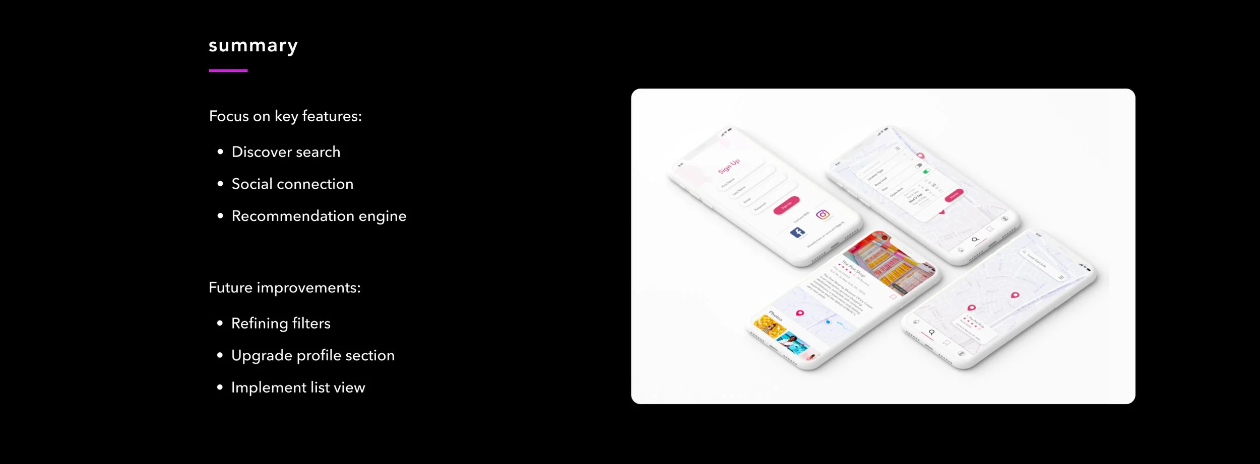
Instaworthy
Case Study for General Assembly UX Design Course (June - August 2018)


INITIAL WIREFRAME
After conducting paper prototype tests, I received positive feedback and went on to design the main features into separate tabs in the navigation bar. I focused largely on the search and discover process and conducted usability tests with a prototype of my initial screens. I learned there needed to be a few adjustments. On the keyboard screen, having the locations populate before hitting the actual search button caused users to start clicking into locations immediately. The result I intended was for users to search in a desired area first before viewing results. In addition, users found the filter box layout hard to understand.

REVISED WIREFRAME
After the first few iterations, I started building the UI elements. I added a bright color scheme and kept rounded buttons throughout for a youthful, bubbly feel.
In addition, I updated the search feature by removing locations on the keyboard screen and changing the filter to have drop-down menus and toggles. I changed the profile option to be able to more easily view other’s profiles and see their recent activity. This adds another layer to the main feature of the app - discovery.